Lean management, Six Sigma, and Lean Six Sigma all walk into a bar. Lean orders a Scotch. Six Sigma orders bourbon. Lean Six Sigma orders a hot toddy. The bartender says, “So that will be a whisky, a whiskey, and a bit of both.”
The joke works because the methods are related, but they are not identical. Lean removes waste, Six Sigma reduces defects and variation, and Lean Six Sigma combines both goals. This guide maps nine practical Six Sigma tools and techniques to the Define, Measure, Analyze, Improve, and Control stages of the DMAIC framework.
You do not need to use every tool on every project. Choose the lightest method that resolves the uncertainty in front of you: map the process, identify risk, prioritize the vital few, distinguish common from special causes, test root-cause hypotheses, improve the workplace, or hold gains with a control plan.
- Lean: Reduce or eliminate activity that does not add value to a process. Learn the core Lean principles.
- Six Sigma: Reduce defects and variation through evidence-based process improvement. Review the Six Sigma principles.
- Lean Six Sigma: Combine waste reduction with variation control inside the DMAIC process.
| DMAIC stage | Question | Tools in this guide |
|---|---|---|
| Define | What problem and process are we improving? | Process flow chart, FMEA |
| Measure | What does the data show? | Pareto chart, SPC |
| Analyze | What could be causing the problem? | 5 Whys, Fishbone diagram |
| Improve | How do we make and sustain a better way of working? | 5S, Kaizen |
| Control | How do we keep the gains? | Control plan |
How to choose the right tool: Start with the decision you need to make, not the diagram you want to draw. If people disagree about how work happens, map the process. If the process is known but the consequences of failure are uncertain, use FMEA. If you have defect or complaint data and need to prioritize, build a Pareto chart. If performance changes over time and you need to separate signal from noise, use a control chart.
Root-cause tools serve a different purpose. Use 5 Whys when a clear causal chain can be tested with evidence. Use a fishbone diagram when the team needs to organize several plausible causes before validating them. Neither method proves a root cause by itself. The investigation still needs observations, records, interviews, or experiments that can confirm or reject each hypothesis.
Once the cause is understood, choose an improvement method that fits the operating environment. 5S is useful when disorder, searching, inconsistent placement, or weak workplace standards create friction. Kaizen is broader: it creates a habit of small, repeated experiments owned by the people doing the work. A control plan belongs at the end because an improvement without ownership, measurement, and a defined response can quietly drift back to the old state.
Some projects need several tools in sequence, but more documentation is not automatically better. A process map followed by one targeted measurement may resolve the issue. A higher-risk process may justify FMEA, data analysis, root-cause validation, a controlled pilot, and ongoing monitoring. Match the depth of the method to the consequence of getting the decision wrong, and record enough evidence that another person can understand the decision and its rationale.
Jump to a DMAIC stage:
- Six Sigma tools: Define
- Six Sigma tools: Measure
- Six Sigma tools: Analyze
- Six Sigma tools: Improve
- Six Sigma tools: Control
- Final thoughts and further reading
Six Sigma tools: Define
The Define stage establishes the problem, the process boundary, and the risks that matter. Start with a process flow chart to see the work, then use FMEA when you need a structured view of possible failures and effects.
1. Process flow chart
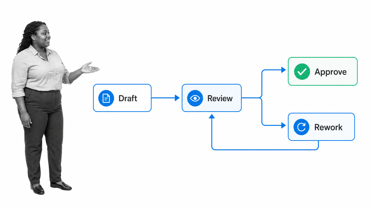
A process flow chart, also called a process map or flow diagram, shows the sequence of work, decisions, delays, and handoffs in a process. It is often the first process improvement tool to use because it gives everyone the same view of how work actually moves.
A useful process map can:
- Clarify the start, end, and boundaries of a process.
- Expose non-value-added activity, rework, queues, and unclear ownership.
- Make handoffs and decision points visible.
- Create a shared baseline for measuring improvement.
Keep the first version simple. Use an oval or rounded node for the start and end, rectangles for activities, diamonds for decisions, and arrows for flow. The symbols matter less than whether the map reflects real work. Tools such as draw.io can make a clean diagram, but a whiteboard is enough to discover the process.
Consider a content approval workflow. A writer submits a draft directly to an editor, who returns extensive corrections. The visible bottleneck is not the editor alone. The map reveals that the draft reaches the editor before a peer review or quality check.
Add a peer-review step, route rejected drafts back for revision, and send only the corrected version to the editor. The improved map makes the new handoff explicit and gives the team a process it can test. The value is not a prettier diagram. It is a clearer hypothesis about where the delay and rework originate.
ASQ includes flowcharts and process maps among the basic quality tools. Use the map to agree on the current state before changing it.
2. Failure mode and effects analysis (FMEA)
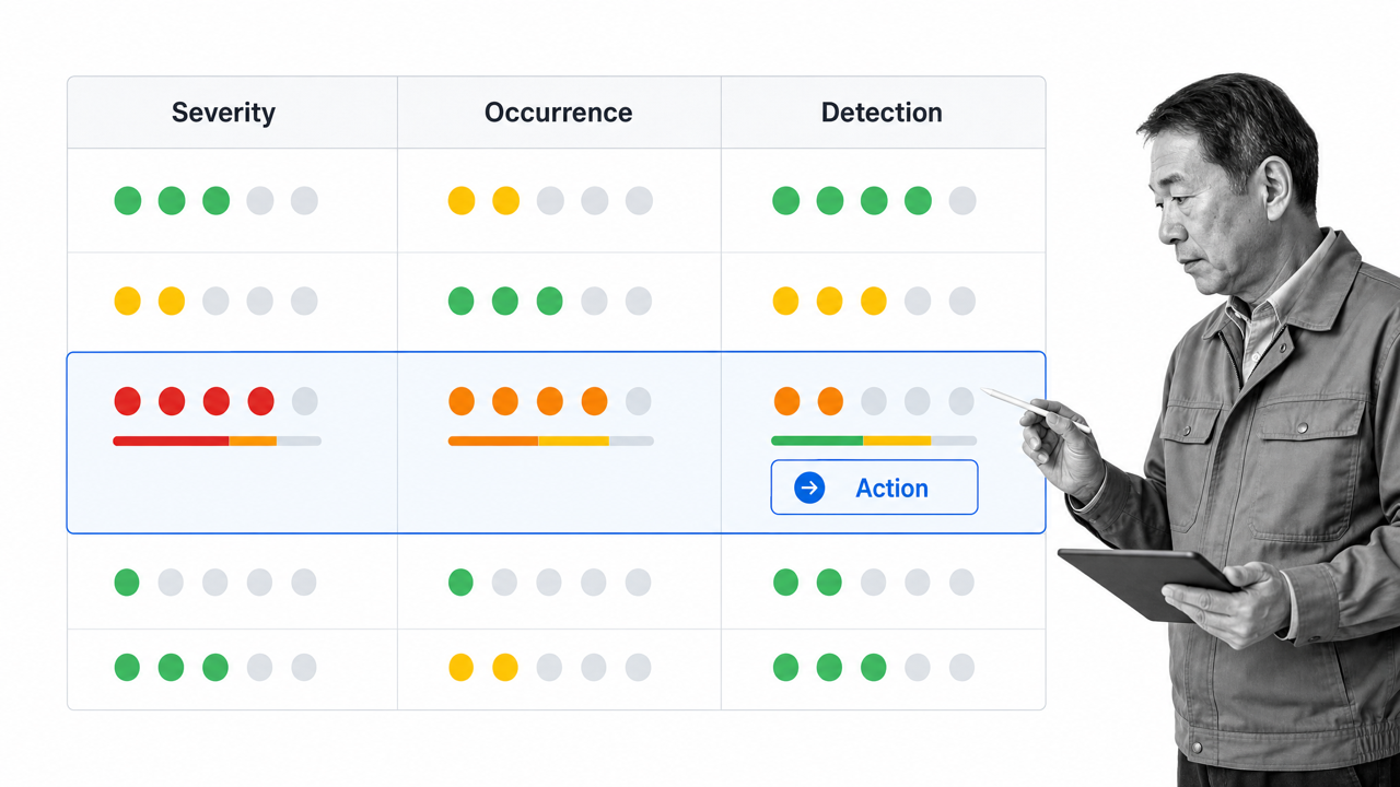
- Severity: How serious is the effect if the failure occurs?
- Occurrence: How likely is the cause or failure to occur?
- Detection: How likely are current controls to detect the failure before the effect reaches the customer or process?
Traditional FMEA often multiplies those ratings to calculate a Risk Priority Number. RPN can help organize discussion, but it should not be treated as a universal decision rule. Different combinations can produce the same score while representing very different risks, and a severe hazard should not be ignored simply because another rating is low.
Use the prioritization method required by your industry or standard. Automotive AIAG/VDA practice, for example, uses Action Priority. Whatever method applies, record the reasoning, proposed action, owner, due date, and evidence that the action reduced the risk. Then reassess the ratings after the action rather than assuming completion equals effectiveness.
Conducting an FMEA can seem daunting, particularly if you’re looking at an entire system of processes rather than a single one. If the grid system makes your eyes glaze over, check out this free template that you can run every time you conduct the failure mode and effects analysis:Six Sigma tools: Measure
Alright, kids, hold on to your hat: if you thought FMEA got complicated, just wait until we get to statistical process control (SPC). (I’m kidding, SPC only looks scary. I promise it won’t bite.) The next two tools will be used to gather all the necessary data about your processes and where your improvements should happen first. The Pareto chart is essentially your elementary school bar graph with a very slight twist, while the SPC method is a flowchart on steroids. One step at a time, though.3. Pareto chart

- Add each sum together to get a grand total: 32 + 27 + 19 + 13 + 9 = 100
- Get the percentage for each item by dividing the sum by the grand total:
- (32 / 100) x 100 = 32%
- (27 / 100) x 100 + a = 59%
- (19 / 100) x 100 + b = 78%
- (13 / 100) x 100 + c = 91%
- (9 / 100) x 100 + d = 100%
- Chart a line on your graph by connecting the points for each percentage.
- Once finished, your Pareto chart should look something like this:
4. Statistical process control (SPC)
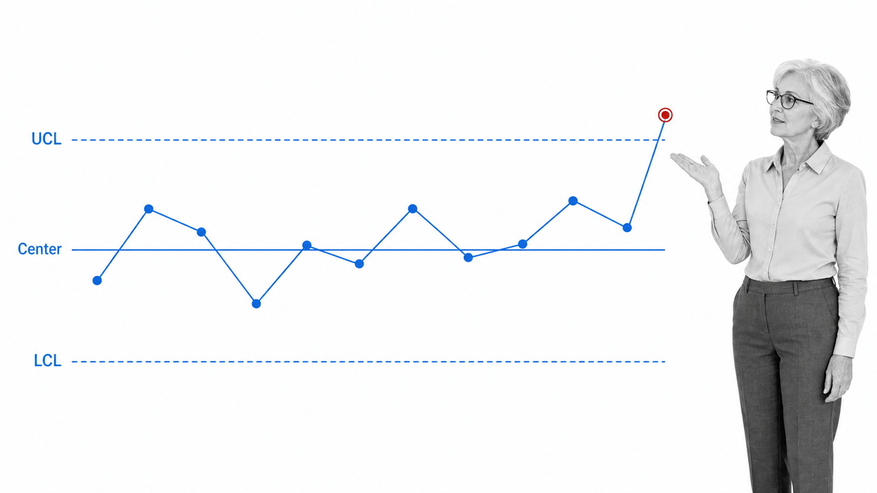
SPC only looks scary. At its core, statistical process control uses time-ordered data to distinguish routine process variation from a signal that deserves investigation.
Walter A. Shewhart developed control charts at Bell Laboratories. W. Edwards Deming later expanded the use of statistical quality control and helped make variation central to process improvement. The method remains useful because reacting to every rise and fall can make a stable process worse.
A control chart usually contains:
- A time-ordered series of measurements.
- A center line representing the process average or another chart-specific statistic.
- Upper and lower control limits calculated from the process data.
Points and patterns inside those limits generally represent common-cause variation built into the current process. A point beyond a limit, a sustained shift, or another chart-specific rule can indicate special-cause variation. Investigate the signal before redesigning the whole process.
There is no universal minimum of 25 points or one four-rule set that applies to every chart. The right chart, subgrouping method, assumptions, and interpretation rules depend on the data and process. ASQ’s control chart guide and the NIST engineering handbook explain the core logic and chart selection.
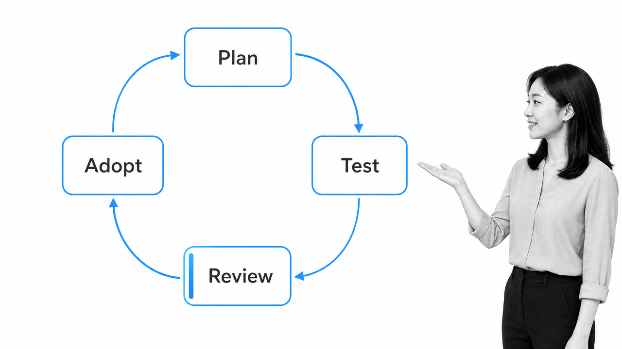
Once special causes are understood and the process is stable enough to learn from, use an improvement cycle such as PDCA or PDSA to test changes. The control chart then helps show whether the improvement shifted the process or merely created another temporary fluctuation.
Six Sigma tools: Analyze
The next few tools are a little easier to use. At least, they don’t require any math to complete. Both the 5-Why analysis and the Fishbone diagram are actually used quite well in conjunction with each other, with the Fishbone diagram serving as a natural extension of the 5-Whys.5. 5-Why analysis
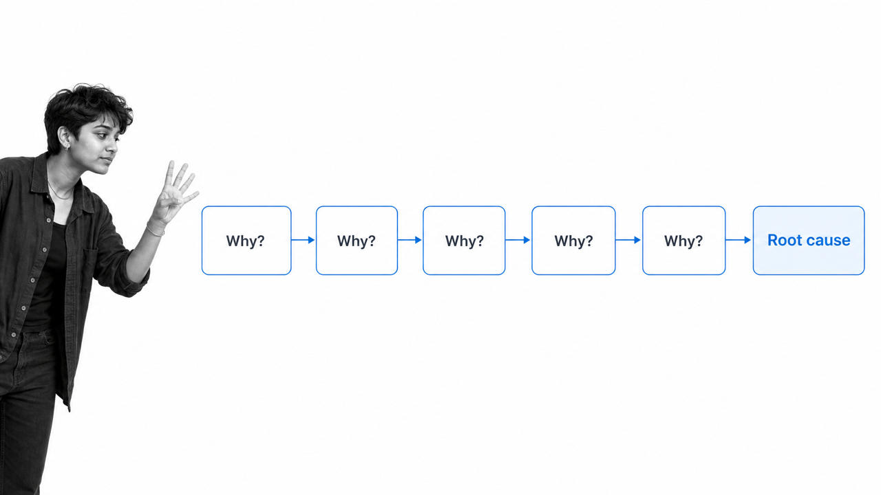
“For want of a nail the shoe was lost…” The familiar chain from Benjamin Franklin’s 1758 “The Way to Wealth” shows how a small cause can compound through a system. Read the primary text.Franklin’s example, converted into a modern 5-Why analysis, would look something like this: The 5-Why analysis shows how a seemingly inconsequential issue can have wide-ranging, and incredibly serious consequences. It encourages teams to look beyond the simple defect at all possible causes, and treat the disease rather than the symptoms.
Five is a prompt, not a proof threshold. Stop when you reach an evidence-supported cause, which may take fewer or more questions, and validate the conclusion with process data before acting.
6. Fishbone diagram
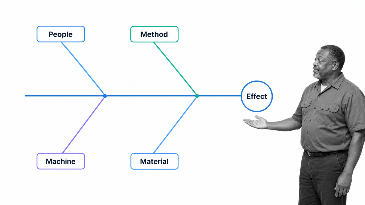
- Write the problem (or effect) on one side of the workspace and draw a “backbone” across the page.
- Decide whether to categorize the causes by function (most common approach) or process sequence.
- Once you have your initial categories, you need to list sub-categories, either through data collection or brainstorming. (This is a good stage to use the 5-Whys.)
- Select the most plausible causes for validation, then use evidence to identify the root cause and create a response. The diagram organizes hypotheses; it does not prove them.
Six Sigma tools: Improve
After defining, measuring, and analyzing the problem, the Improve stage changes how work is done and makes the better method easier to sustain. 5S stabilizes the workplace, while kaizen keeps the process evolving through small, owned improvements.
7. 5S tool
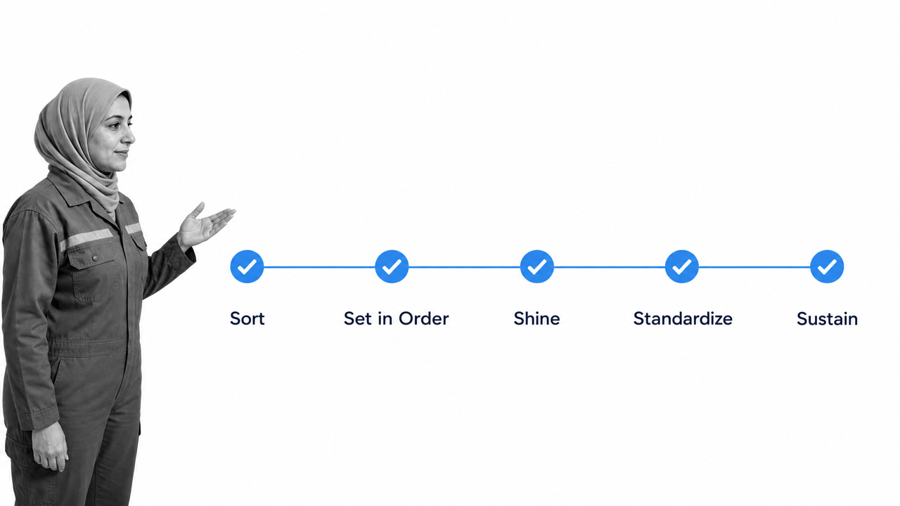
- Seiri
- Seiton
- Seiso
- Seketsu
- Shitsuke
- What’s the purpose of this item?
- How often is it used?
- Does it really need to be here?
- Which items are used most frequently?
- Where is the best placement for the items?
- Is more storage needed to stay organized?
- What tasks need to be completed every day? Every week?
- Who should be responsible for each task?
- Are processes documented and optimized for adherence?
- Are new employees taught the proper processes?
- Is the whole team holding each other accountable?
- Can the processes be improved in any way?
8. Kaizen
Six Sigma tools: Control
Personally, I don’t think control is the best word here, but no one asked me when they came up with the acronym. The final stage of DMAIC is where you make sure your new processes are running consistently and efficiently. Process documentation is the name of the game at this point; you want a clear, accessible plan outlining the changes that are being made, the order they’ll be made in, and who will be making them. That way you’re able to monitor the improvements to ensure they actually are improvements. Alternatively, you’ll also be able to see where the improvements aren’t.9. Control plan
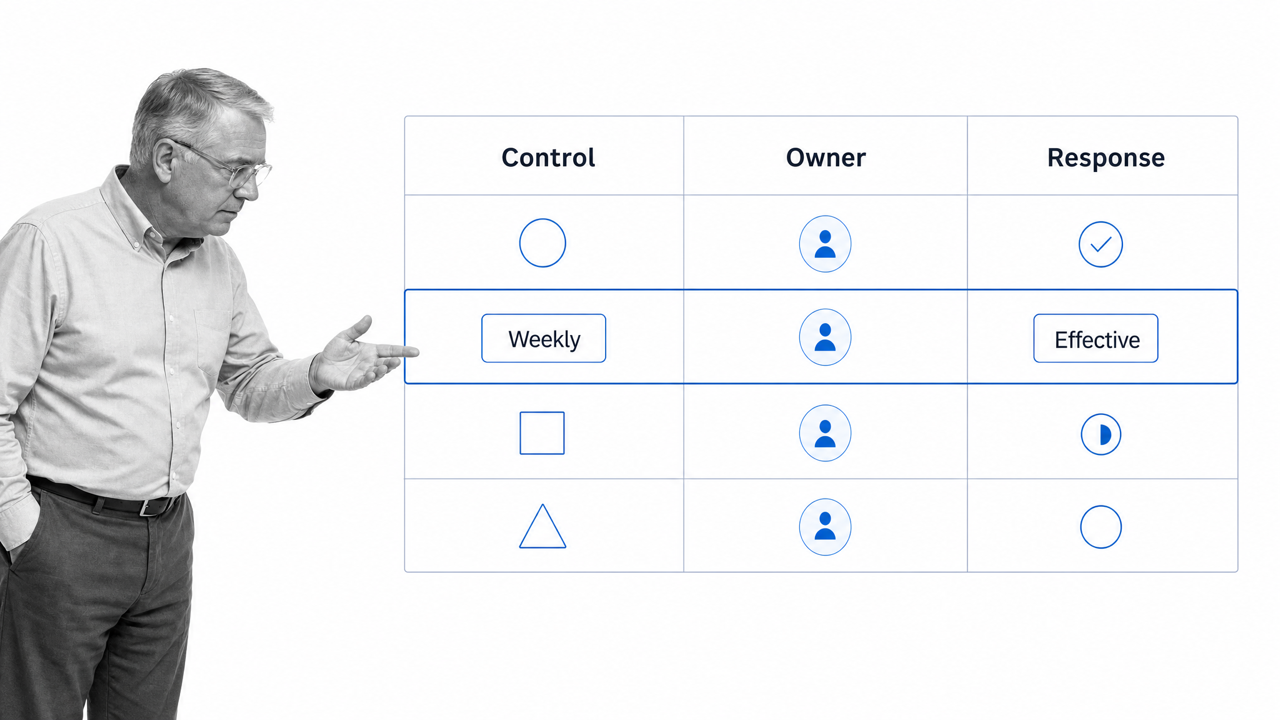
A control plan is the documented agreement for holding an improvement in place. It connects each critical process characteristic to an owner, a measurement method, a review frequency, acceptable limits, and a response when performance moves outside those limits.
A useful control plan answers:
- What must stay in control?
- Who owns the measure and the response?
- How and how often will the process be checked?
- What evidence proves the check happened?
- What action follows a missed limit or failed effectiveness review?
Keep it proportional to the risk. A simple process may need one short register. A regulated or safety-critical process may need linked procedures, approval records, evidence, escalation paths, and formal review cadence. ASQ distinguishes a quality or control plan from a decision matrix, which compares options rather than monitoring performance.
Process Street is a single Compliance Operations Platform with Docs and Ops capability areas plus built-in AI. Teams can govern the procedure in Docs, execute the control through auditable Ops workflows, and use built-in AI to flag missed steps, delays, and improvement opportunities. That keeps the control plan connected to the work instead of leaving it in a static spreadsheet.
Final thoughts and further reading
These are still my personal favorites among Lean Six Sigma tools. I do not enjoy solving equations, but I do enjoy a good diagram, which makes the effort worthwhile.
Visual methods make it easier to explain how work flows, where variation or waste enters the process, and what needs to change. The important part is not the diagram alone. Document the decision, test the improvement, assign ownership, and keep evidence that the new process works.
If you need adjacent methods, explore these quality management tools and the following guides:
- How to Solve Your Problems With Lean Six Sigma
- Gap Analysis: How to Bridge the Gap Between Performance and Potential
- What is Process Mining? 9 Tools to Optimize Your Process Management
What is your favorite Lean Six Sigma tool? Did I leave out one that deserves more attention?
The post Conquer Process Improvement With These 9 Lean Six Sigma Tools first appeared on Process Street | Compliance Operations Platform.


0 Commentaires