A user onboarding process moves someone from first contact to a useful result without making them stop and study the product first. The best onboarding reduces uncertainty, reveals the next useful action, and lets the user build skill through the work itself.
Microsoft’s secret user onboarding made that principle memorable. Minesweeper, Solitaire, and Hearts looked like bundled entertainment, but each game also helped people practice an unfamiliar part of graphical computing. The lesson still applies: effective onboarding turns product mechanics into purposeful progress.
How Software User Onboarding Teaches Through Action
Low-touch onboarding is the opposite of a concierge experience. Instead of relying on a person to guide every customer, the product teaches users at scale through its interface, defaults, feedback, examples, and sequence of actions. That approach matters when a company cannot work one-to-one with every new user.
A strong software user onboarding process begins with a clear first-value event. That is the first result that proves the product can help. The steps before it should ask for only the information and effort needed to reach that result. Everything else can appear later through progressive disclosure.
Microsoft’s early Windows games are a clever historical example. The company was asking people to move from command-line habits to a graphical interface. An obvious mouse tutorial could have felt patronizing or tedious. Familiar games created a safer practice environment, and the feedback was immediate.
99% Invisible documents the often-repeated design story that the games reinforced skills needed for Windows. The exact intent behind every design decision is difficult to prove from the outside, but the interaction mapping is clear and remains useful as an onboarding case study.
The story was popularized by James Hunt in an article about the true purpose of Solitaire, Minesweeper, Hearts, and FreeCell. Each game connected a familiar setting to concepts vital for success with Windows 3.1. Minesweeper taught mouse precision and right-click behavior. Solitaire taught drag-and-drop. FreeCell rewarded careful movement between ordered spaces. Hearts made networked computers and shared state feel less abstract.
That approach eased the transition from the command line to a graphical user interface. Instead of a Biblical user manual or an obvious tutorial, users encountered a gray grid, a deck of cards, a smiley face, and implied explosions. The games felt like entertainment, but they quietly prepared people for the mechanics behind modern apps.
Minesweeper
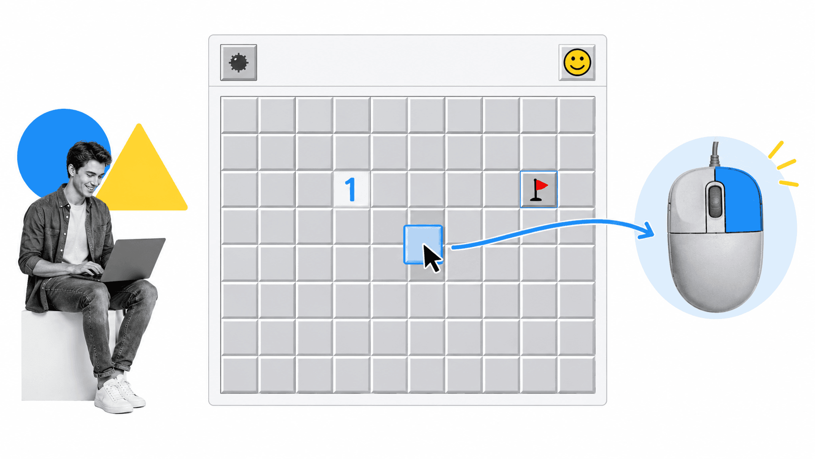
Minesweeper gave people a grid of precise targets. A normal click revealed a square. A secondary click marked a possible mine. The player learned pointer accuracy, the difference between mouse buttons, and the relationship between an action and a visible state change.
The lesson worked because the goal belonged to the game, not to the operating system. Users repeated the same basic interactions voluntarily, saw the consequences immediately, and improved through practice. Good onboarding uses the same loop: action, feedback, correction, and a small win.
Before the internet became an everyday office tool, Minesweeper was the biggest office time-suck and an addictively simple lesson. Hours spent clearing an 8×8 field still produced a valuable lesson. The player learned that the left and right mouse buttons behaved differently, that precise targets mattered, and that a mistake had an immediate consequence. The fun kept the practice from feeling like training.
Microsoft Solitaire
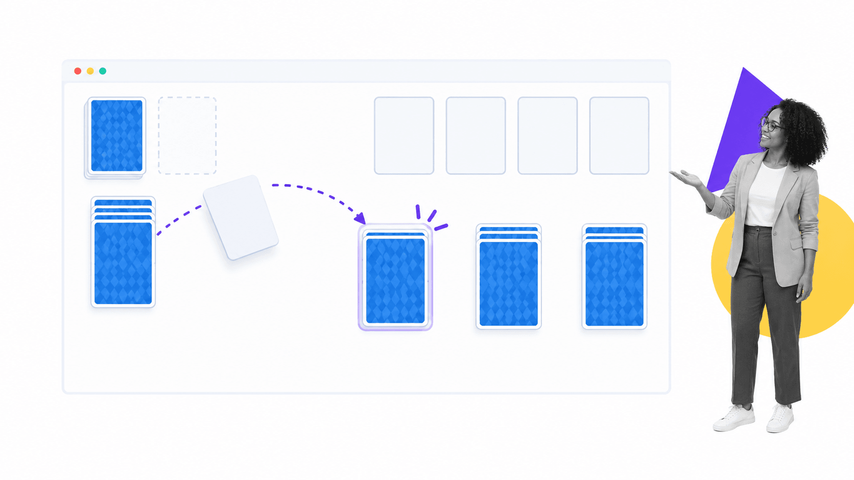
Solitaire used a familiar card game to make drag-and-drop feel natural. Players clicked a card, held it, moved it across the screen, and released it on a new stack. That interaction is ordinary now, but it was not ordinary to someone meeting a graphical desktop for the first time.
The design principle is contextual guidance. Teach a behavior at the moment it becomes useful, inside a task the user already understands. A separate tour that describes drag-and-drop is weaker than an experience that makes the user perform it to reach an obvious goal.
Solitaire dates back centuries, so many people already knew the rules. That familiar concept gave Microsoft cover to teach a new mouse skill without announcing a lesson. A tutorial about clicking and holding would not have gone down well with command-line experts ready to roll their eyes at the graphical excesses of anything other than a terminal.
Once learned, the same drag-and-drop system appeared everywhere. A virtual deck in a game such as Hearthstone or a board of cards in Trello uses the same basic mechanic. Trello adds the familiarity of a wall full of sticky notes, letting users transfer an existing mental model to software.
Hearts
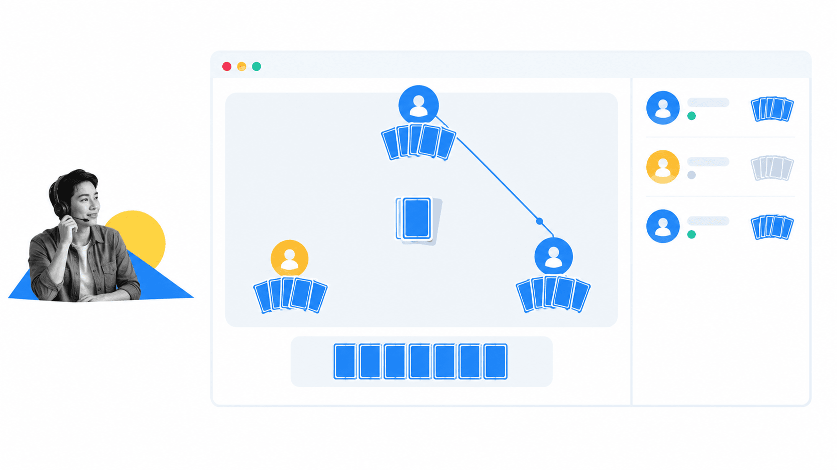
Hearts appeared in Windows for Workgroups, where networked play made computers feel connected rather than isolated. Players could see that an action on one machine affected people on other machines. The game made an abstract network concept concrete.
The enduring lesson is to show collaboration by letting people collaborate. A product tour can say that work is shared, but an invitation, handoff, comment, or live status change demonstrates it. Onboarding should make a product’s core value observable as early as possible.
Windows for Workgroups 3.1 was the first network-ready version in this story. Hearts could be played against people on other computers through a local network. The joke is that it secretly prepared offices for Counter Strike LAN parties, but the serious point is simpler: computers could send and receive data, and a shared game made that invisible exchange understandable.
Slack and a Modern Low-Touch Success Story
Slack’s early onboarding became well known because it turned setup into a conversation. Slackbot acted like a friendly guide, asked for profile details, and demonstrated messaging behavior inside the product. The flow gave an otherwise empty workspace a responsive first contact.
Slack has changed substantially since that early experience, so the screenshots and exact prompts from its launch era should be read as historical examples. The design pattern remains current: a conversational guide can collect information, answer a first question, and reveal the next action without forcing users through a dense settings screen.
Slackbot invited comparison with Clippy, the overly enthusiastic paperclip and help document from Microsoft Office. The difference was context. Rather than waiting outside the work, Slackbot joined the conversation. Samuel Hulick’s Slack onboarding analysis helped make the broader experience famous, while the robotic greeter demonstrated direct messages, profile setup, notifications, and the basic rhythm of reading and sending a reply.
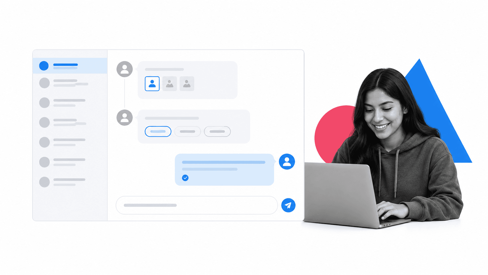
A useful guide also demonstrates the product’s communication model. A simple trigger-and-response interaction shows where a message goes, what a response looks like, and how automation can help. The user learns the interface while solving a real question.
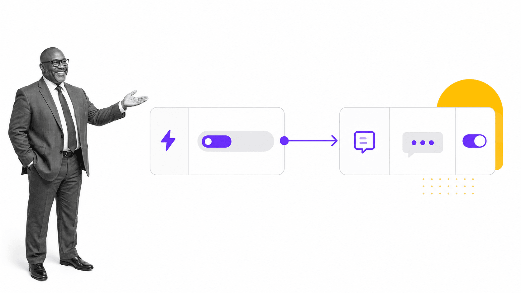
This is especially valuable in an empty state. A blank workspace can feel like a demand to invent a system from scratch. One clear, contextual first action lowers the cost of starting. The action should be specific enough to complete now and meaningful enough to create visible progress.
An assistant can also fetch resources when a new employee asks a familiar question. The important part is not the friendly robot personality. It is the connection between a need, a direct response, and a useful next step. A helpful placeholder turns an otherwise blank slate into orientation without overwhelming the user.
In practice, the same guided flow can add details to a profile, send direct messages, activate an early win-state, and bring assistance into the moment it is needed. Those actions are more useful than a separate setup page that explains them in advance.
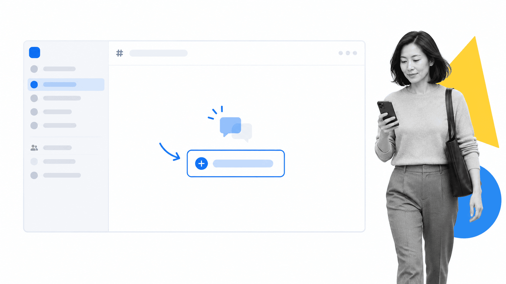
The deeper pattern is not a mascot or a scripted chat. It is an onboarding system that watches for context and offers the smallest useful intervention. Use assistance when it helps the user continue, and get out of the way when the path is already clear.
Gamification Beyond Microsoft’s Hidden Lessons
Microsoft used actual games. Most software products use selected game mechanics instead: visible progress, short goals, immediate feedback, optional challenges, and a sense of increasing mastery. These mechanics work only when they support the user’s goal. Points and badges cannot rescue an experience that delays value.
Gamification should answer three practical questions. What useful behavior should a new user repeat? What feedback confirms that the behavior worked? What progress signal helps the user decide what to do next? If the answers are vague, adding a reward layer will create noise instead of motivation.
Apps are not forced to choose between functionality and ease-of-use. In a crowded market, the strongest products combine both. Apps without gamified onboarding can still use the same basic concepts: familiar interaction, clear goals, timely assistance, visible progress, and a choice of useful next actions. Gamification is an option, not a requirement.
Yu-Kai Chou’s work on gamification describes onboarding as an experience phase rather than a single screen. Narrative, goals, progress, challenge, and feedback can combine to help a user understand what matters. The point is not to make every business tool look like a video game. It is to borrow the parts that make learning visible and motivating.
Step-by-step tutorials
Step-by-step tutorials work best when they are short, active, and tied to a real task. Duolingo is a familiar example because a learner starts answering questions quickly. The tutorial is not a lecture about the interface. It is a guided version of the activity the person came to do.
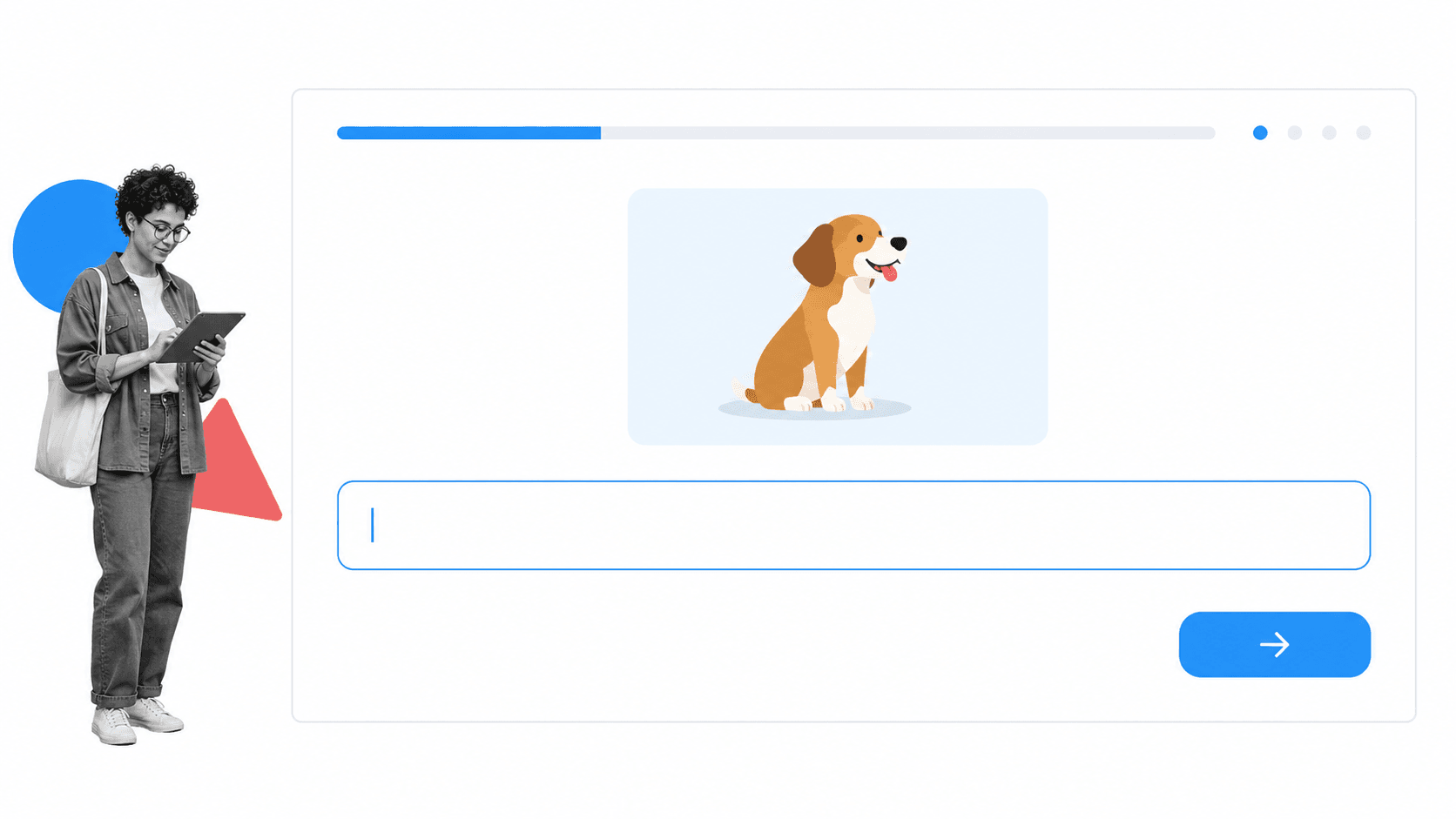
Immediate feedback closes the learning loop. A correct answer, completion mark, or visible advance tells the user that the action worked. The reward does not need to be elaborate. It needs to be legible, timely, and connected to something the user values.
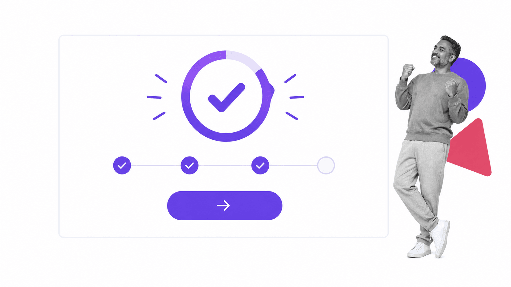
Progressive disclosure keeps the first experience manageable. Show the minimum controls needed for the current task, then introduce advanced options as the user develops context. This reduces cognitive load without hiding the product’s long-term depth.
A progress bar is familiar to anyone who has played a role-playing game such as World of Warcraft, Final Fantasy, or Skyrim. It makes movement toward a goal visible. In software, that same pattern should represent real capability, not activity for its own sake. The user should know what has changed and why the next step matters.
Early win-states
Games often make the first level easy enough to complete quickly. That early win proves the controls work and gives the player momentum before the challenge increases. Software teams often call the equivalent an aha moment, activation event, or first-value milestone.
The milestone should reflect genuine value, not an arbitrary setup step. Creating an empty project is rarely enough. Inviting a collaborator, completing a workflow, importing useful data, or producing a first output is stronger because it shows why the product deserves another session.
Games use instant gratification carefully. A player may move from level one to level two within minutes, while later progress requires far more effort. That first reward creates confidence and encourages another attempt. Software designers can use the same principle without manipulation by connecting the early win to the product’s real purpose.
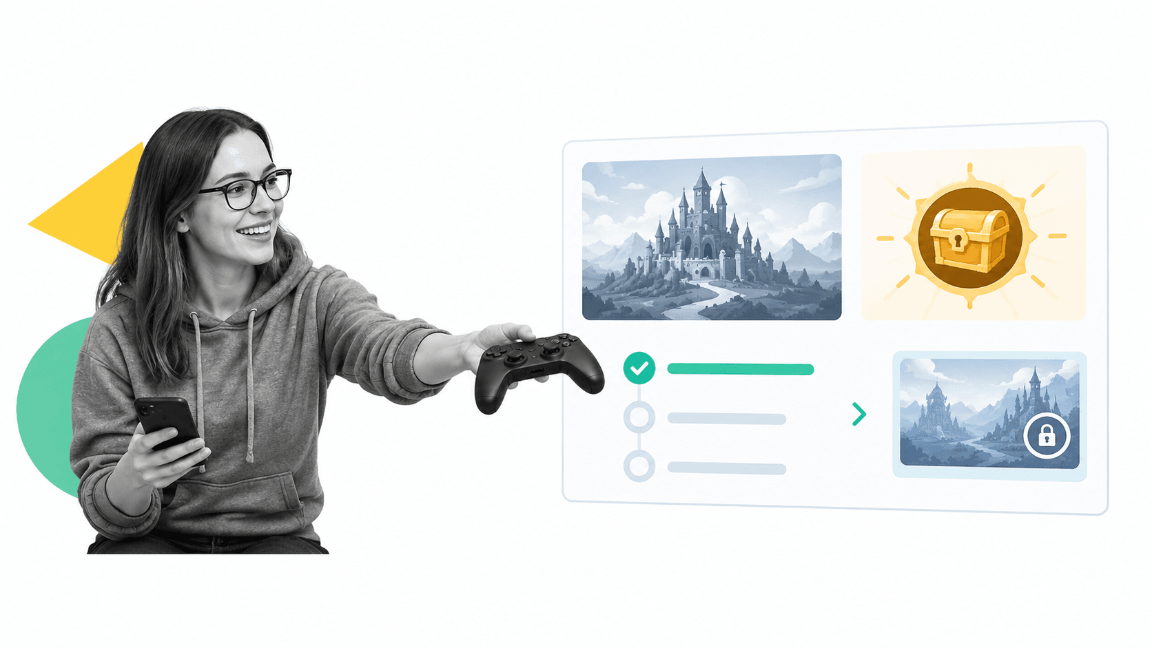
A getting-started checklist can make that route visible. Evernote has used checklist-style onboarding to encourage setup actions. The pattern is effective when every item has a clear purpose, the list is short, and completion moves the user closer to a useful outcome.
A list with a few items left unchecked creates a gentle pull toward completion. That can be motivating, but the product should not condition users to perform meaningless setup. Each checked item should unlock a capability, reduce future effort, or prove that the system can help. Positive reinforcement is useful only when it rewards useful behavior.

Measure whether early wins predict durable success. Track the time to first value, activation rate, completion of critical steps, help-seeking behavior, return usage, and retention by onboarding path. A high checklist completion rate means little if the completed actions do not improve later outcomes.
Identity creation
Character creation helps game players establish ownership. Social and collaborative software can do something similar with a profile, team name, role, or workspace. GrowthHackers and many other communities have used prefilled profile details to reduce setup effort and help a new member feel present.
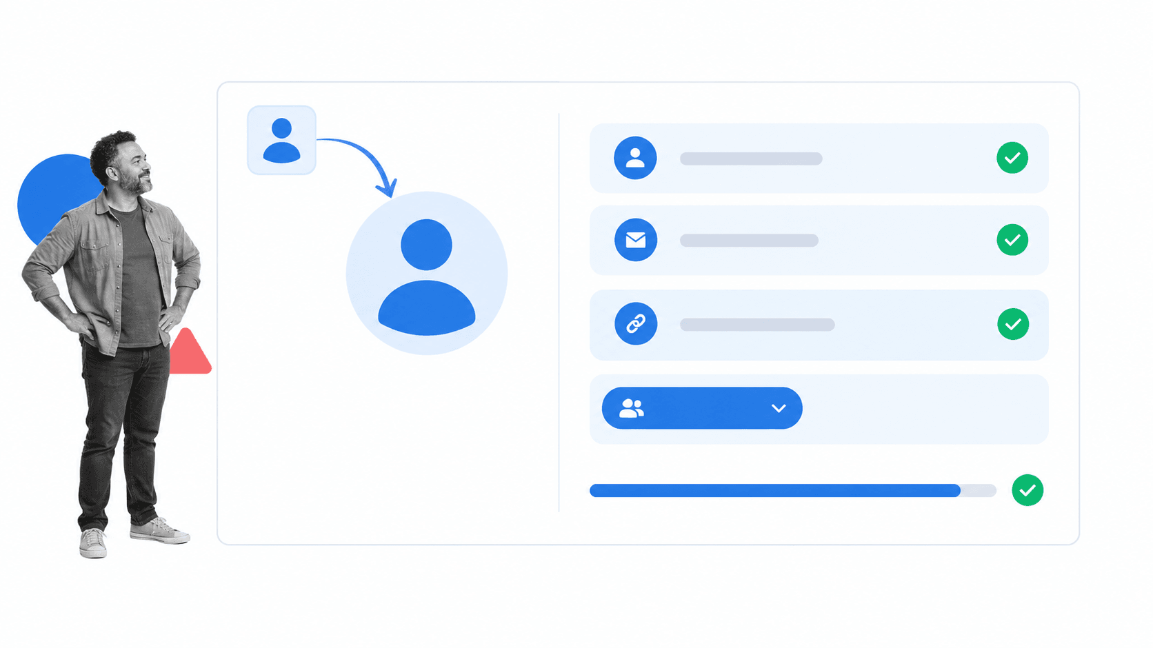
Identity setup should remain proportionate and transparent. Ask only for details that improve the experience, explain how they will be used, and let the user correct imported information. A profile should create relevance and trust, not become a barrier before value.
Video games often begin with character creation, from naming a save file to customizing appearance, voice, and history. Social software uses a lighter version of the same idea. A name, picture, role, and a few preferences make the space feel personal. The effect resembles the attachment people feel after building something themselves: a little effort can create ownership.
Design Onboarding Around Useful Mastery
The durable lesson from Microsoft’s secret user onboarding is a mastery loop. Let the user attempt a meaningful action, provide clear feedback, and make the next attempt easier or more capable. Repeat that loop until the product’s core behavior feels natural.
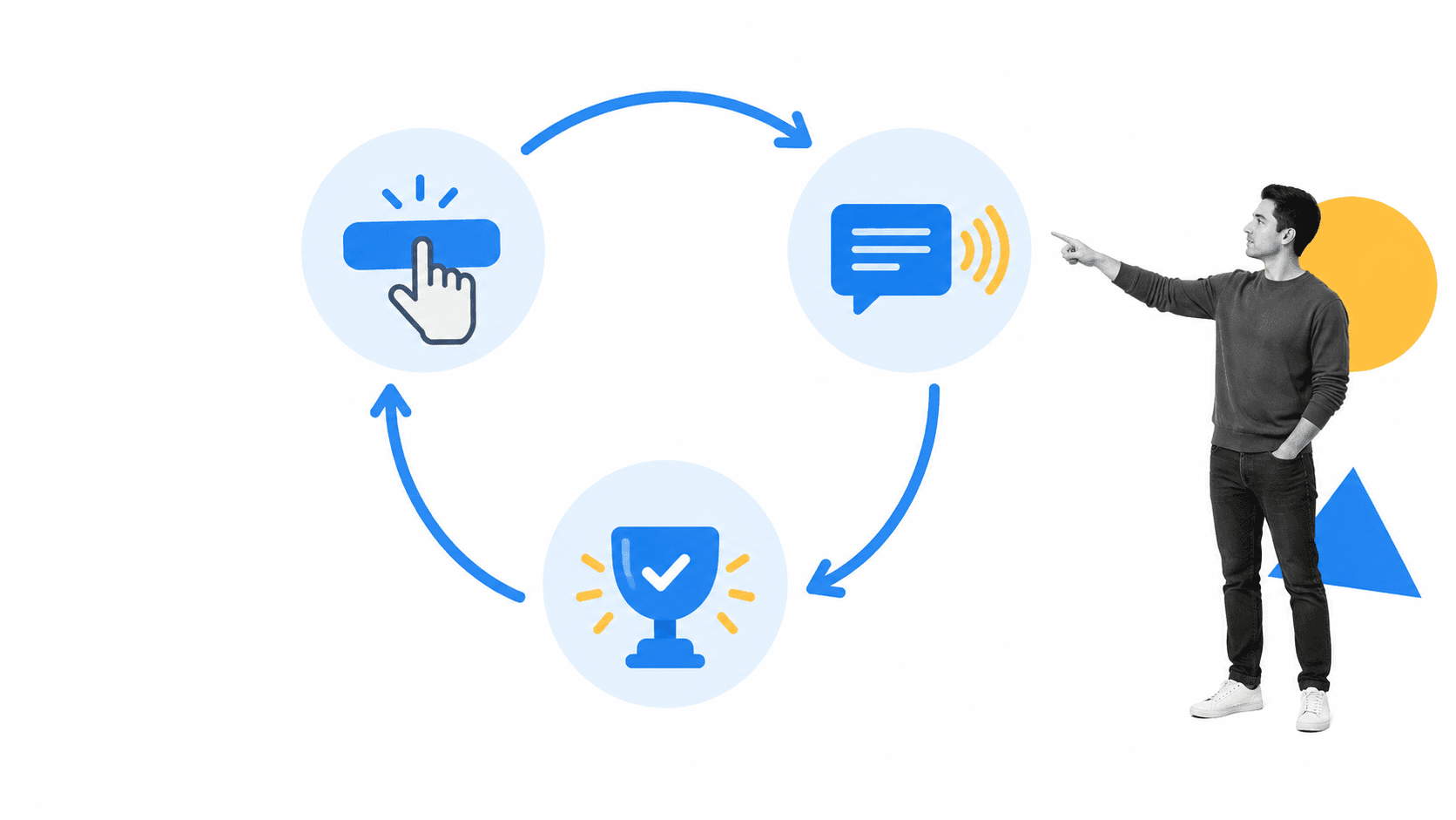
Start by mapping the user’s path to first value. Identify the decisions, permissions, data, and behaviors required to reach it. Remove anything that is optional. Then choose the smallest intervention for each remaining obstacle: a useful default, sample content, inline explanation, template, checklist, prompt, or human handoff.
Design for recovery as well as the happy path. If a user skips a step, enters incomplete data, loses permission, or returns after a week, the product should explain what happened and offer a direct route forward. Helpful error states are part of onboarding because users learn the system most clearly when something does not go as expected.
For teams choosing a platform to run these journeys, this guide to user onboarding software explains the capabilities to compare. The right system should make ownership, handoffs, due dates, evidence, and performance visible without turning the experience into administration.
Process Street is a single Compliance Operations Platform with Docs and Ops capability areas plus built-in AI. Docs capability areas keep onboarding guidance, policies, and process knowledge current. Ops capability areas run the work, including assignments, approvals, handoffs, and evidence capture. Built-in AI helps teams draft, monitor, and improve those processes while people retain control over decisions.
Software does not need to disguise every lesson as a game. It does need to respect attention. Give users a meaningful action, make the result clear, and reveal complexity only when it helps them succeed.
Learning through play works because the user stays alert, notices new things, and connects action with consequence. The same thing happens in effective business software. A welcoming experience can still support serious tasks, while a difficult experience can make valuable functionality feel unreachable.
User Onboarding Process FAQ
What is a user onboarding process?
A user onboarding process is the sequence that helps a new user understand a product, reach a first useful result, and build enough confidence to continue independently.
What should a software onboarding process include?
It should include a clear first-value milestone, only the setup required to reach it, contextual guidance, useful defaults, feedback after important actions, recovery paths, and measurement tied to activation and retention.
How do you measure user onboarding?
Measure time to first value, activation rate, completion of critical actions, help usage, return behavior, and retention. Compare those outcomes by onboarding path rather than treating tour or checklist completion as success on its own.
The post How Microsoft’s Secret User Onboarding Process Fooled Us All first appeared on Process Street | Compliance Operations Platform.


0 Commentaires